
Flow: How To Use “Screen”

Screen element is absolutely my favorite flow feature! It is the key to make your flows interactive and to solve all types of business problems. Here we will focus on introducing the general layout and some components that are more advanced.
A: General Layout

1. Canvas
The main interface your users will see.
2. Components
All the available components you can drag to the canvas to display.
3. Screen Properties
General label and API name of the screen element.
4. Configure Frame
The section to toggle the header and footer on or off. Header is the top row that will show the name of the flow, and footer is where the Pause/Previous/Finish buttons are.
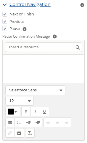
5. Control Navigation
The section to customize the footer. This is helpful when you want to constrain how your flow should be run. For example, if you do not want the users going back to the previous step, simply toggle off the “Previous” option. Also, the “Pause” option is only available if Let Users Pause Flows is enabled in your instance.
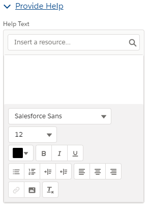
6. Provide Help
You can add help text to the screen element itself or to each component. There will be a 🛈 showing after the label once you populate the help text. Please note that if you choose not to show the header, the 🛈 of header will also not be shown.

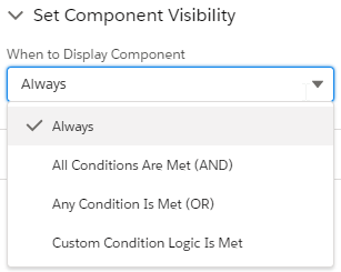
7. (Component-specific) Set Component Visibility
You can apply custom logics to each component to decide when should they show up. Ex. Only ask for email address if users want to subscribe for newsletters.
8. (Component-specific) Validate Input
This is like the Salesforce validation rules. The error message you specified will show up if the formula is evaluated to be true. The real difference between Validate Input and Validation Rules is that if users enter a wrong input, the Validate Input will keep them from continuing the flow until the input is corrected, while Validation Rules will fail the flow directly.

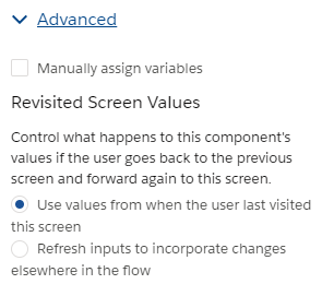
8. (Component-specific) Advanced – Manually Assign Variables and Revisited Screen Values
By default, Salesforce will save all the input values into auto-generated variables. You can rewrite that setting by checking “Manually assign variables”. Only use this when you have very clear purposes.
After Spring 2021 release, you can also change the behaviors if users revisit the screen element.
B: Components
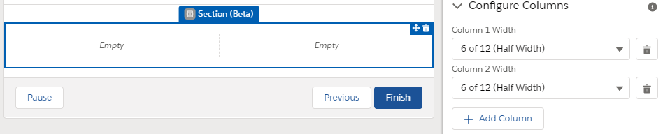
1. Section (Beta)
After Spring 2021, you can now add multiple columns to your screen element. There can be up to four columns and they will have equal width. (This is super helpful! I had been looking forward to this feature for a long time.)
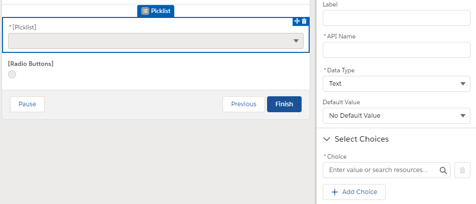
2. Choice component – Radio Buttons/Picklist
In the choice article we introduced these components that have to work with choices. Here we want to emphasize radio buttons and picklists because they are the only two choice components that allow for different types of choices besides text. This is important because you can only use the choices that have the same data type of these components.
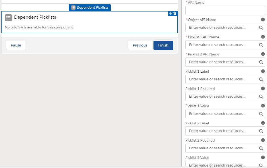
3. Dependent Picklists
You can have up to three dependent picklists showing up here, under the condition that you have configured the dependencies in the Object Manager > Fields & Relationships.
After you have done that, simply put in the API names for the object (ex. Account) and the fields (ex. Rating and Customer_Priority__c). You can show the fields with a different name using Label, set requirement using Required, and set default value using Value.
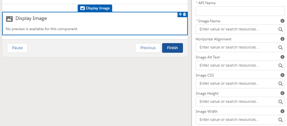
4. Display Image
The most special part of Display Image is the way you should link the image. You need to first upload the image as a static resource in your org (Go to Setup > Search for “Static resources“), and paste the name in the Image Name field.
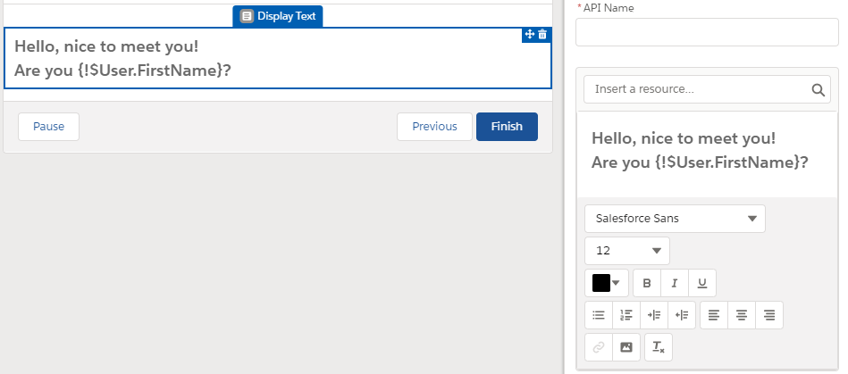
5. Display Text
You can display rich text here or even add the resources/variables of the current flow here. Sometimes when you change the text color, the background will become white while the flow’s background is gray. To fix that, hit the clear format button (Tx) and redo the format again.
6. Password
Automatically hide what your users are putting in.

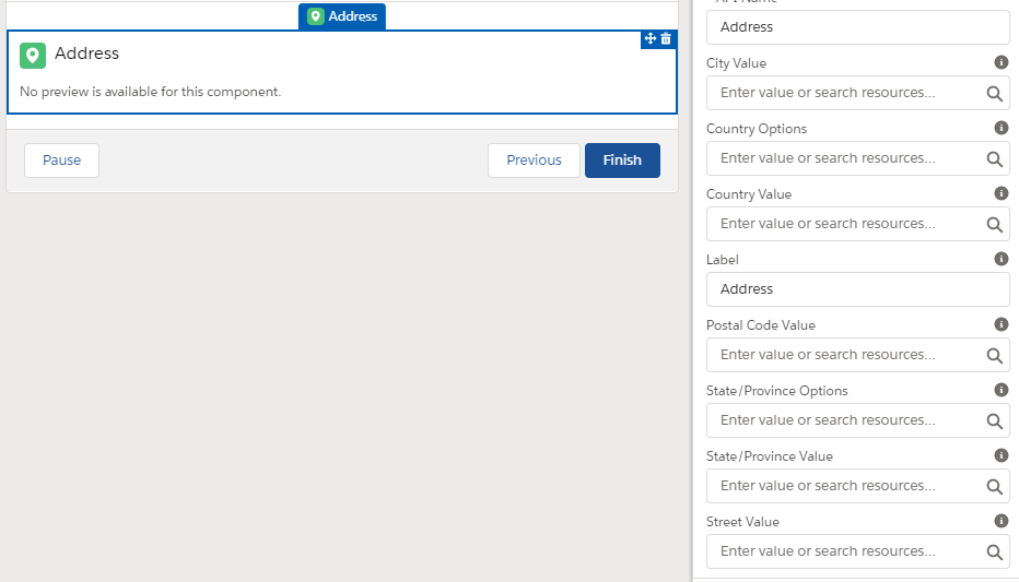
7. Address
There are two main types of fields – options and values. The value fields are for setting the default value while the options (Country/State and Province) are more special. If you have the state and country picklist enabled in your org, these will show as picklist fields. If not, they will show as a text field. However you can create a picklist choice set to either rewrite the Salesforce default picklist or turn the text field into a picklist field.
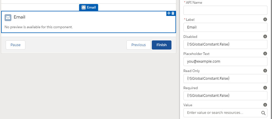
8. Email
Disabled: Prevent the users from editing and copying the email shown.
Read Only: Prevent the users from editing the email shown, but they can still copy it.
Placeholder: Can be used as an example of the acceptable input, but will not be saved as the actual value if users don’t change it.
Value: Place to set the default value. If the default value is not empty, it will replace the placeholder text.
9. Phone/URL
Besides the disabled and read-only options, there is also the “pattern” field where you can set the acceptable format of phone and url. Here we suppose to use the regular expression, however so far I have only managed to control the length (^[\d]{9,12}) instead of the format for phone, so some suggested useing REGEX() in the validation input section instead. For url, you can try this:
^https?://(?:www\.)?desired_domain_name\.com/?.*
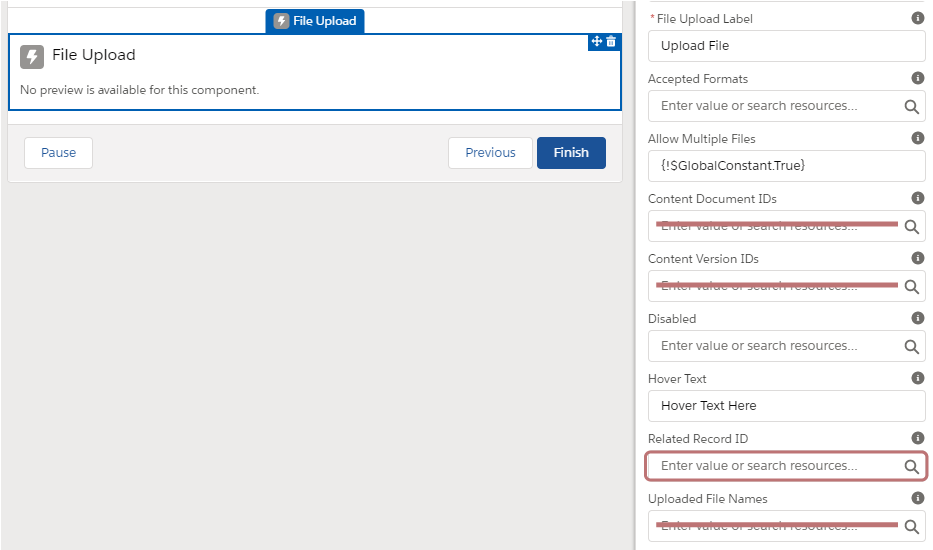
10. File Upload
Let users upload one or more files. To my understanding, the fields with strikes aren’t supposed to have any values filled in, rather they are for manually assigning the values in the advanced section. For Accepted Formats, type in .ext and use comma to separate them (Ex. .jpg, .png).
The Related Record ID is crutial as your files won’t be considered uploaded if the ID is empty. One issue is that after you upload the files, there won’t be any confirmed messages unless you go to the next screen and use a display text. This might confuse your users if not communicated properly.
Hover Text:

Disabled:
After Uploaded:
11. Lookup
Lookup component is commonly used, but a very confusing one. It might make more sense if you want to modify an existing value. For example, If I have a lookup (user) field called “Support_rep__c” on account, and I want to put out this field for editing, I can type:
Field API Name: Support_rep__c
Object API Name: Account
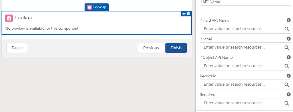
Easy! But the first issue comes up – what if I want to change the account owner? Should I use OwnerId as the Field API Name? Well, after my testing, I found out that using OwnerId does not work as it is not showing any users as options. If you want to change the account owner, you can still use support_rep__c to first get all the users, and then update the account owner Id with the result of your lookup. This is why I said it’s a confusing component, as you do not need to use the API of the field that you wish to edit, as long as they have the same type. Meaning, since Support_rep__c and OwnerId are all lookup (user) fields, you can use the first in lookup to change the second just fine.
Then it comes to issue number 2! If I want to make a flow to send out emails to any users of my choice, what should I do? Of course you can create a lookup(user) field on the email message object, but more easily, you can still use Support_rep__c field on Account to get the desired user. That said, you do not even need to use the fields on the same object in order to use lookup component. (So strange isn’t it…)
Phew! It was a lot to cover, but screen element is really the magic of Salesforce flow! So take some time to dive into the cases that have screen elements included.
Check Out How Screen Can Be Used In Real Cases!
Use Case: Update Order and Order Product Dates Quickly
Use Case: Let Experience Cloud Users Update Contact Records
Thank you for the useful info, usually the flow screen outputs will come into a box. can we avoid that box?
Hi Tejaswi, my pleasure! Could you elaborate more on the “box”? What do you mean the outputs will come into a box. Let me know and I will see how I can help!
If a screen component is a picklist (let’s call it ‘Call Disposition’) where a user selects one of the 3 choices in the dropdown (let’s say they selected ‘Call Successful’), do I need to use an Assignment element to assign that selection (‘Call Successful’) to a new flow variable if I wanted to later use it in Decision or Update Records elements?
Hi Lana, you should be able to refer to the screen component directly, and it will store the value that is chosen by the user.
Thank you Melody!